In the next year or so , the Internet bigwigs say that mobile deviceswill be responsible for the majority of all internet data. I believe them!
This means that unless you have a website specifically designed to work well with small screens, touch screens, high PPI devices, then you will be preventing users from using your website easily, or preventing them from using it at all!
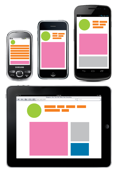
An much better alternative (in most cases) to having a separate website specifically for mobile devices, is having a website with a Responsive Design. This term, coined by Ethan Marcotte, describes a site that can recognise and respond to the capabilities of the visitors device.
This technique initialy delivers a site that is ideal for small/less capable devices and then by design, recognises when a device is larger and has more advanced features. It then responds to these by changing the way the site looks, behaves and delivers content appropriate for the screen size.
All our new customer websites use a responsive design (As of eKit CMS version 5.0) When you update your website using eKit CMS, you are creating content that is delivered in the best format for any device type or web browser that your visitor is using.
Feel free to contant me if you have any questions on The Mobile Web or Responsive Web Design.

 Woody
Woody Website template design and layout
 Usability, Accessibility and Web Standards
 Web design training and workshops